
“researched and illustrated with exemplary thoroughness” (Rick Poynor)
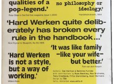
Back cover

Back cover text


APR 06, 2018 Book review by Rick Poynor:
Hard Werken: the studio that shocked Dutch graphic design
There was always something rock star-like about Hard Werken. This wasn’t a bunch of unassuming backroom designers. Founded in 1979, Hard Werken came from Rotterdam, then the world’s busiest port, a sleeves-rolled-up, get-it-done-today kind of city. They bristled with attitude. Their design was excitingly unpredictable and more genteel colleagues found it disturbing – “it’s so ugly,” one designer complained to a design writer. “I formulate my own commissions and there are no rules,” said HW member Gerard Hadders. An apoplectic newspaper critic once called for Hadders to be thrown into jail for his crimes against decorous design.
In the 1980s, Hard Werken were among the most noteworthy designers working in the Netherlands. It was a measure of their standing that Wim Crouwel, Gert Dumbar and Anthon Beeke were happy to collaborate with them on special projects. In 1981, HW’s Henk Elenga set up their ‘LA Desk’ in Los Angeles and Rick Vermeulen became a regular lecturer at CalArts, Cranbrook Academy of Art and other American institutions. They were less well known in the UK and since their demise in 1994 – when they merged, improbably, with Ten Cate Bergmans, specialists in packaging, and became Inízio – Hard Werken have been largely forgotten.
A new monograph, researched and illustrated with exemplary thoroughness, is an overdue reminder of a body of graphic work that ranks as one of the most original from the 1980s. Hard Werken: One for All is co-authored by Ian Horton, a reader in graphic communication at the London College of Communication, and Bettina Furnée, a Dutch artist based in the UK. My first sight of the 480-page volume emerging from its package was an authentically disarming Hard Werken moment. The spine has a repellent rubber binding that looks like a smear of bitumen, with a crudely applied sticker for the title. Inside, 75B (also from Rotterdam) have done a canny job of channelling HW with a melange of different type styles for each chapter and an inviting profusion of images that verges on chaos.
Hard Werken began life as a collective publishing a magazine devoted to arts and culture, also titled Hard Werken. It was initially produced by Grafische Werkplaats, run by Willem Kars – another core member of HW – and supported by the Rotterdam Art Foundation (RKS). The ten large-format issues, published from 1979 to 1982, exhibit the postmodernist rule-breaking pluralism that came to define HW’s approach. Every feature has its own graphic style and the assertively variegated design appears to be as important as the literary content, which became a bone of contention with the editors from a writing background. Horton and Furnée see the magazine both as a fanzine and an early example of graphic authorship. Hard Werken was a big influence on Rudy VanderLans, Dutch émigré co-founder of the similarly oversized Emigre magazine, although he didn’t hold an actual copy in his hands until 1984, when Elenga showed him one.
The centrality of the magazine to the emergence of HW underlines a key point explored in the book. From the outset, the members assumed an interdisciplinary stance and their non-graphic activities informed their approach to graphic design. Elenga designed furniture and lights; Hadders designed lights and took photographs; both Elenga and Hadders also saw themselves as artists. Tom van den Haspel designed theatrical stage sets and interiors, and they all worked as exhibition designers. In this company, Vermeulen, a prolific designer of books and book covers, was probably the closest to being a dedicated graphic designer.
HW’s interdisciplinary way of thinking was crucial to their use of staged photography and the book considers this aspect of their practice in detail. This method of fabricating the content of a photograph dates back to modernism, and Studio Dumbar are the Dutch designers most clearly identified with it (at least for British viewers) through their collaborations with the photographer Lex van Pieterson. Staged photography was, however, just as significant for Hard Werken – Pieter Vandermeer was their regular photographer – and, looking at the dates of key projects by the two teams, HW’s commitment to the practice was possibly established earlier than Dumbar’s. HW lashed together playful tableaux in the studio using paint, wire, found debris and bluntly fashioned props, and when used as design elements these ramshackle bricolages made ideal settings and counterpoints for their discordantly eclectic typography.
On the cover of an issue of Lecturis magazine, published in 1981, the designers’ modus operandi is represented by two rashers of bacon on a plate with facial features cut out of paper. In 1984, the team made a festive appearance on the sleeve of a self-released Yuletide record with Kars as Father Christmas wielding a whip over his grovelling semi-naked colleagues who are decked out as reindeer. This “reveals quite a lot about Hard Werken,” the monograph’s authors note wryly.
HW’s motivation throughout their great first phase was never the money. They benefited from Dutch subsidies when these were still easy to come by and their financial arrangements, managed by Kees de Gruiter, were opaque. The book is refreshingly candid about this side of their history. There were tax troubles and a new bookkeeper was dismayed by the state of their spreadsheets. According to Kars, interviewed by Horton, the phase prior to de Gruiter’s departure from HW in 1986 had involved “a lot of coke, alcohol and women”.
By the end of the 1980s, Hard Werken needed to find a viable way forward. They had 15 employees and work for the cultural sector was insufficient to sustain them. Hadders was envious when he found out how much designers at Studio Dumbar were earning. Kars paid visits to Total Design and Wolff Olins to learn how these commercially-minded companies operated. HW still struggled to attract corporate clients and enlisted a financial whizz kid. “This was a big mistake,” says Vermeulen. Hadders declined to join the merger with Ten Cate Bergmans that turned into Inízio. Vermeulen freelanced for Inízio for only a year after a spell in LA and, in time, even Van den Haspel and Kars, who were company directors, moved on.
In retrospect, given the kind of freewheeling set-up that Hard Werken had been, it’s hard to imagine how this business-orientated reboot could ever have worked. We should pass over that end of the story and concentrate on the early years, which have creative lessons to impart that shouldn’t be ignored. What does it mean for design to be a form of ‘culture’ in the most generous and open sense of that word? What experiences, information, insights and pleasures does this deliver that we wouldn’t otherwise possess? If Hard Werken are still worth studying three decades later, it’s because their work at its zenith was a magnificently free interdisciplinary outpouring of visual media and unbridled invention – design as a cultural gift.
Rick Poynor is Professor of Design and Visual Culture at the University of Reading. Hard Werken: One for All. Graphic Art & Design 1979-1994, by Ian Horton and Bettina Furnée with contributions by Russ Bestley, Max Bruinsma, Tony Credland, Frits Gierstberg and Noor Mertens, is published by Valiz (35 Euros).
The post ‘Hard Werken: the studio that shocked Dutch graphic design’ appeared first on Creative Review.
